A pose or action should clearly communicate to the audience the attitude, mood, reaction or idea of the character as it relates to the story and continuity of the story line. The effective use of long, medium, or close up shots, as well as camera angles also helps in telling the story. There is a limited amount of time in a film, so each sequence, scene and frame of film must relate to the overall story. Do not confuse the audience with too many actions at once. Use one action clearly stated to get the idea across, unless you are animating a scene that is to depict clutter and confusion. Staging directs the audience's attention to the story or idea being told. Care must be taken in background design so it isn't obscuring the animation or competing with it due to excess detail behind the animation. Background and animation should work together as a pictorial unit in a scene.
Examples of effective STAGING cited by Frank Thomas and Ollie Johnston in "The Illusion of Life" -


(sorry, some of these scans got cut off around the edges)
Dopey (on Sneezy's shoulders) dances with Snow White :
(I had some trouble uploading this movie clip . If it doesn't play in the interface, try this link:
Staging_Dopey_Sneezy.mov )


These animation roughs by Fred Moore show his masterful sense of staging and appeal .
Animator/teacher Hanna Abi-Hanna, created this video to demonstrate how a master animator can use effective STAGING to lead the viewer's eye , to create a center of interest in the composition . (this is especially important when animating two characters in dialogue , to direct the viewer's eye to the character or the point on the screen you want them to look at) -
----------
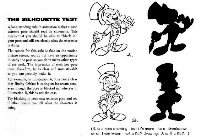
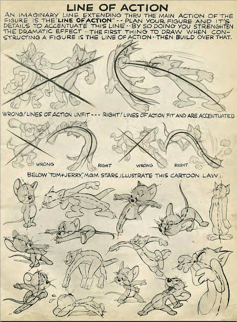
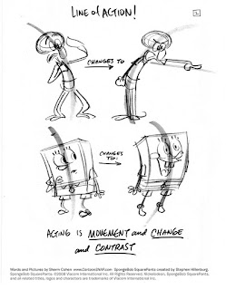
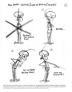
Part of strong STAGING (also "Solid Drawing" and "Appeal") is the use of clear LINE-OF-ACTION and SILHOUETTE value in your drawings.
Here are some examples from Disney and other studios -
From Mark Kennedy - http://sevencamels.blogspot.com/2010/04/kick-in-head-part-one.html

More Notes on Silhouette Value , from handouts prepared by Eric Larson and Walt Stanchfield:

"Line of Action" from Preston Blair's classic book on Animation :
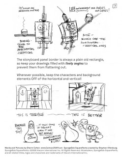
From Sherm Cohen: http://shermcohen.deviantart.com/art/SpongeBob-Storyboard-Notes-255210415

From Sherm Cohen: http://shermcohen.deviantart.com/art/SpongeBob-Storyboard-Notes-255210415


----------
See these links for more specific information about STAGING scenes when you are Storyboarding or Laying-Out a scene:
http://www.floobynooby.com/wordpress/drawing-and-composition-for-visual-storytelling/
http://theartcenter.blogspot.com/search/label/Storyboarding
http://www.animationmeat.com/pdf/televisionanimation/strybrd_the_simpsonsway.pdf
http://shermcohen.deviantart.com/art/SpongeBob-Storyboard-Notes-255210415
Dreamworks Storyboarding Notes
⇒ See Chapter 7 'On Layout and Staging" in the book "Character Animation Crash Course" by Eric Goldberg. (if you don't have this book then GET IT ! )
.
⇒ See Chapter 7 'On Layout and Staging" in the book "Character Animation Crash Course" by Eric Goldberg. (if you don't have this book then GET IT ! )
.
No comments:
Post a Comment
Note: Only a member of this blog may post a comment.